As I already mentioned, this package comes with a few different date and time controls. The most popular of these, and the one which prompted my interest in the suite, is the DateTextBox control. In addition to the DateTextBox, the suite includes a MonthYearTextBox and an AnniversaryTextBox.
As an aside, I’ve recently been working with Paul Wilson’s UIMapper.net framework, which includes a DatePicker widget based on the ASP.NET Calendar. If you’ve used the ASP.NET Calendar as a datepicker, you will know that it’s somewhat lacking. I was able to incorporate Peter’s DateTextBox into Paul’s UIMapper code in about ten minutes, and it worked beautifully. I think you’ll find that integrating Peter’s controls into third party tools will be no more difficult than integrating the built-in WebControls, provided the third party has architected their solution to allow for such integration.
DateTextBox
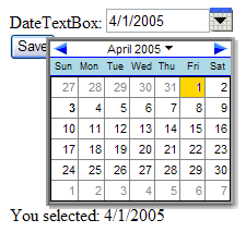
The DateTextBox consists of a TextBox control that has been heavily modified to include a dynamic pop-up calendar that populates the contents of the TextBox. It also features a ContextMenu that includes some quick-selection options, which you as the developer can customize. Figure 1 shows an example using the default stylesheet. I tested the controls using IE 6.0 and Firefox 1.0 (Mozilla 5.0) and their appearance was virtually identical.
Figure 1: DateTextBox with default style (IE6).
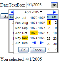
One serious failing of the default ASP.NET Calendar control is its inability to allow for rapid year changes. For instance, in order to select a birth date, which could fall anywhere within an eighty year range, the default ASP.NET Calendar would force a postback for every month change - of which there could easily be several hundred. Not good. The DateTextBox allows selection of any month-year combination through its dropdown control, and this is all accomplished client-side (no postbacks!). Figure 2 demonstrates the use of this dropdown control in Firefox 1.0.
Figure 2: DateTextBox dropdown menu for month-year selection (Firefox 1.0).
All of the DateTextBox’s functionality provides for a truly first-rate customer experience. However, it comes at a small price. The sample page used for Figures 1 and 2, which included a DateTextBox, a Button, and a Label, as well as about 1KB of HTML, weighed in at about 45KB. This includes Viewstate (not from PeterBlum's controls -- they use very little Viewstate) and other ASP.NET overhead, as well as a large amount of Javascript required for the DateTextBox’s operation. This would not be an issue on an intranet or a broadband Internet connection. However, it is a consideration. The User's Guide does offer some tips for how to reduce this overhead, especially for pages that use multiple date package controls, and these tips will reduce the overhead. Compared to the functionality that is provided, the extra script that must be downloaded is pretty minor – about the size of a detailed banner image – but you should definitely keep it in mind if you’re using multiple DateTextBox controls on one of your pages.
MonthYearTextBox
Sometimes, all you need to capture is the month and year portion of a date. The most common example of this is the credit card expiration date scenario. For such cases, the MonthYearTextBox is the way to go, providing a simple drag-and-drop solution. Figure 3 shows an example of the MonthYearTextBox in action.
Figure 3: MonthYearTextBox (IE6).
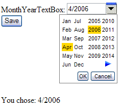
Notice that the minimum year is 2005, and there is no left arrow. This is because I set the minimum date to DateTime.Today. Obviously we don’t want to accept credit cards that have expired. You could do something like this using a series of DropDownList controls, and perhaps some RangeValidator controls, but it would take a lot more code than was required for this solution. The MonthYearTextBox also provides a much better user experience.
AnniversaryTextBox
Similar to the MonthYearTextBox, which takes just Month and Year and omits the Day, the AnniversaryTextBox allows selection of only the Day and Month portion of a date. This is useful for--you guessed it--anniversaries, as well as any other dates that repeat annually. Figure 4 shows an example of the AnniversaryTextBox in action.
Figure 4: AnniversaryTextBox (Firefox 1.0).

Not much else to say here--it pretty much just works, without the Year.
Shared Features
All of these selection controls include pop-up calendars to provide an intuitive, easy-to-use user interface. However, some applications, such as data entry, are most efficient when the user doesn’t need to take his hands off of the keyboard. Another nice feature of each of these controls is that they provide keyboard filters and auto-text formatting. For instance, if you type an invalid character into the TextBox by accident, it will not even register. And if you decide to shortcut the year to just two digits, it will automatically convert it to the appropriate four-digit year (you can control how this is done). All of this means that data entry operators can use these controls quickly and efficiently. From the User's Guide:
When the user exits the TextBox, the date automatically reformats to match the xDateTimeFormatInfo [property] rules for lead zeros on months and days, and assign the century when a 2-digit year is entered. For example, if the xDateTimeFormatInfo.ShortDatePattern is MM/dd/yyyy an the user types in ‘1/4/02’, it will reformat to ‘01/04/2002’. You can establish a rule where the month is reformatted into its abbreviated month name instead of digits.
Other useful features:
- Omit the month and year, and today’s values will be used.
- Omit date separator characters, and separators will be added automatically. For example ‘905’ will be converted to ‘09/05/2005’.
- Single Key Commands such as ‘T’ for Today, which can be assigned programmatically.
- Built-in support for minimum and maximum dates.
QuickDateMenu
One last date-related control is the QuickDateMenu, which can be used in conjunction with any of the above DatePicker controls. You can populate the menu, which functions like a DropDownList, with several common dates or date ranges. When the user selects one of these options, the corresponding DatePicker control (or controls) will be populated with the appropriate values. For example, a common scenario for report pages is to include controls for Start and End dates, as well as a dropdown with common selections such as ‘Last Week’ or ‘Year to Date’. The QuickDateMenu makes this scenario easy to accomplish.