AspAlliance.com LogoASPAlliance: Articles, reviews, and samples for .NET Developers
URL:
http://aspalliance.com/articleViewer.aspx?aId=1032&pId=-1
Resources in XAML
page
by Keyvan Nayyeri
Feedback
Average Rating: 
Views (Total / Last 10 Days): 46332/ 49

Introduction

One of the main reasons to introduce CSS in conjunction with XHTML is the ability to reduce the size of the user interface code and share the same layout across several pages and elements.  This could allow for consistency between pages.  XAML, which is a markup language to declare user interfaces in .NET 3.0 and Windows Vista, comes with the concept of resources to produce the same functionality.

By having resources in hand, we can declare a look and use it several times across a page or application.

Resource management is actually a part of the Windows Presentation Foundation, but I will discuss it as a part of my XAML tutorials because they are correlated together.

In this article I introduce resources in XAML and how to use them to declare a constant look across controls, windows, pages or whole application.

Static Resource

This kind of resource gives back a value of a resource.  Listing 1 shows a simple example of static resource.

Listing 1

<Window x:Class="ResourcesInXAML.Window1"
    xmlns="http://schemas.microsoft.com/winfx/2006/xaml/presentation"
    xmlns:x="http://schemas.microsoft.com/winfx/2006/xaml"
    Title="Resources In XAML" Height="200" Width="300"
    >
  <Window.Resources>
    <SolidColorBrush x:Key="myBrush" Color="GreenYellow" />
  </Window.Resources>
  <Button Background="{StaticResource myBrush}"
          Width="200" Height="40" Name="myButton">
    ASP Alliance
  </Button>
</Window>

As I stated in the introduction, resource management is a part of the Windows Presentation Foundation so you do not need to use the "x:" prefix to refer to it.

If you want to implement static resources in code, their code equivalent is FindResource method for elements.  Listing 2 shows this in action.

Listing 2

myButton.Background = 
    (Brush)myButton.FindResource("myBrush");

Note that, as the name suggests, a static resource is useful for scenarios in which you want to get the value for a static value.  If you want to retrieve the value for a dynamic value (a value that changes on runtime), dynamic resource is your choice because static resource will not be updated on runtime to specify any change.

Dynamic Resource

You saw that static resource is not appropriate for some scenarios when you want to have a result that can be updated for changes in other elements.  In order to solve this you can use dynamic resources.

Listing 3, Listing 4 and Figure 1 use dynamic resources to show how they work.  I used a dynamic resource to track all changes for the background color of my Window and set myButton background to it.  Once this value changes, myButton must get the same background.  Listing 5 shows the simple code I used to change the background of the Window when the user clicks on a button.

Listing 3

<Window x:Class="ResourcesInXAML.Window1"
    xmlns="http://schemas.microsoft.com/winfx/2006/xaml/presentation"
    xmlns:x="http://schemas.microsoft.com/winfx/2006/xaml"
    Title="Resources In XAML" Height="200" Width="300"
    >
  <Window.Resources>
    <SolidColorBrush x:Key="myBrush" Color="GreenYellow" />
  </Window.Resources>
  <StackPanel Margin="30">
    <Button Background="{DynamicResource Window1.Background}" 
            Width="200" Height="40" Name="myButton">
      ASP Alliance
    </Button>
    <Button Click="OnClick" Width="200" Height="40">
      Change Background
    </Button>
  </StackPanel>
</Window>

Listing 4

public void OnClick(object sender, RoutedEventArgs args)
{            
    this.Background = Brushes.GreenYellow;
}

Figure 1

Resources in Action

As I stated earlier, the concept of resources is very similar to the concept of CSS.  The benefits are same.  This means you can easily spread a look across controls, pages or your application.  Also by using resources you can have smaller codes and easily change or modify your look without changing each and every element many times.

There are two kinds of resources in Windows Presentation Foundation: Global and Local.  Syntax is the same for both kinds, but Global resources can be declared for whole page and all its controls.  However, Local resources can be declared for a special element.

Another thing that is worth mentioning is that every XAML element has a set of resources.  You must declare a resource before using it, otherwise compiler cannot understand it.  So you must put control resources before setting the attribute that will use them.

You need to have a reference to the XAML namespace since some tags to declare resources are in the XAML namespace.  So in addition to default Windows Presentation Foundation, you must have a reference to XAML namespace (I suppose it is "x:" in my samples).  In order to declare a resource, you must use a key attribute for each resource that is an identifier that helps you to refer to the resource via other elements.  This key attribute is in XAML namespace.  Other attributes are the attributes you use for your elements to declare your desired look for them.

Listing 5 and its output, Figure 2, show a Global resource.

Listing 5

<Window x:Class="ResourcesInXAML.Window1"
    xmlns="http://schemas.microsoft.com/winfx/2006/xaml/presentation"
    xmlns:x="http://schemas.microsoft.com/winfx/2006/xaml"
    Title="Resources In XAML" Height="150" Width="300"
    >
  <Window.Resources>
    <SolidColorBrush x:Key="myBrush" Color="Coral" />
  </Window.Resources>
  <StackPanel Margin="30">
    <Button Background="{StaticResource myBrush}" 
            Width="200" Height="40">
      ASP Alliance
    </Button>   
  </StackPanel>
</Window>

Figure 2

Styles

The concept of style should not be unfamiliar for you since you have already seen it in HTML, XHTML and CSS.  Styles help you to declare an appearance for a special element or declare a style for a specific type of elements.

Each style consists of a key as its identifier to let you refer to it via other elements (if you are declaring a style locally for an element, you can ignore the key attribute) and a collection of Setter elements that you declare your appearance via them.  Key is a part of XAML namespace so you should use XAML prefix to refer to it ("x:" in my samples).  You can also use a TargetType attribute for your style to specify the type of element that your style will be applied to.

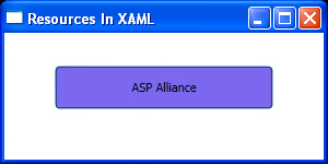
Listing 6 represents the simplest way to declare a style for a Window then use it for your elements.  Figure 3 shows the output.

Listing 6

<Window x:Class="ResourcesInXAML.Window1"
    xmlns="http://schemas.microsoft.com/winfx/2006/xaml/presentation"
    xmlns:x="http://schemas.microsoft.com/winfx/2006/xaml"
    Title="Resources In XAML" Height="150" Width="300"
    >
  <Window.Resources>
    <Style x:Key="myStyle">
      <Setter Property="Control.Background" Value="MediumSlateBlue" />
    </Style>
  </Window.Resources>
  <StackPanel Margin="30">
    <Button Style="{StaticResource myStyle}" 
            Width="200" Height="40">
      ASP Alliance
    </Button>
  </StackPanel>
</Window>

Figure 3

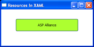
Listing 7 and Figure 4 are good examples to show that if you use TargetType attribute for your style and do not refer to it in your elements, this style will be applied to all elements of that type.

Listing 7

<Window x:Class="ResourcesInXAML.Window1"
    xmlns="http://schemas.microsoft.com/winfx/2006/xaml/presentation"
    xmlns:x="http://schemas.microsoft.com/winfx/2006/xaml"
    Title="Resources In XAML" Height="150" Width="300"
    >
  <Window.Resources>
    <Style TargetType="{x:Type Button}">
      <Setter Property="Control.Background" Value="GreenYellow" />
    </Style>
  </Window.Resources>
  <StackPanel Margin="30">
    <Button Width="200" Height="40">
      ASP Alliance
    </Button>
  </StackPanel>
</Window>

Figure 4

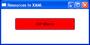
The last point about styles is they have an object oriented manner (you can remember that XAML elements represent CLR classes).  Therefore, you can inherit your styles from another style and extend it.  All you need to do to inherit a style from another style is to declare BasedOn attribute for that style and set it to another resource that you want to inherit from.

Listing 8 and Figure 5 show an example of inheritance for styles.

Listing 8

<Window x:Class="ResourcesInXAML.Window1"
    xmlns="http://schemas.microsoft.com/winfx/2006/xaml/presentation"
    xmlns:x="http://schemas.microsoft.com/winfx/2006/xaml"
    Title="Resources In XAML" Height="150" Width="300"
    >
  <Window.Resources>
    <Style x:Key="ParentStyle">
      <Setter Property="Control.Background" Value="Red" />
    </Style>
    <Style x:Key="Child" BasedOn="{StaticResource ParentStyle}">
      <Setter Property="Control.Foreground" Value="Black" />
    </Style>
  </Window.Resources>
  <StackPanel Margin="30">
    <Button Width="200" Height="40" Style="{StaticResource Child}">
      ASP Alliance
    </Button>
  </StackPanel>
</Window>

Figure 5

Triggers

Triggers are one of the sweet parts of XAML and Windows Presentation Foundation.  They save you from coding many user interface level events.  Actually, triggers help in changing an attribute of an element when a condition is true.

For example, when the mouse is over a Button, by using triggers you can change its background dynamically on runtime to your desire color.

Each style can have a collection of triggers for different attributes of an element.  As triggers will be declared inside styles, all of what I said about styles can be applied to triggers as well.  So you can declare a trigger for a specific element locally, all elements on a page or a special kind of element.

Listing 9, Figure 6 and Figure 7 represent the use of triggers for a page to change the background of a Button once the mouse is over it.

Listing 9

<Window x:Class="ResourcesInXAML.Window1"
    xmlns="http://schemas.microsoft.com/winfx/2006/xaml/presentation"
    xmlns:x="http://schemas.microsoft.com/winfx/2006/xaml"
    Title="Resources In XAML" Height="150" Width="300"
    >
  <Window.Resources>
    <Style x:Key="myStyle">
      <Style.Triggers>
        <Trigger Property="Control.IsMouseOver" Value="True">
          <Setter Property="Control.Background" Value="Red" />
        </Trigger>
      </Style.Triggers>
    </Style>
  </Window.Resources>
  <StackPanel Margin="30">
    <Button Style="{StaticResource myStyle}"
            Width="200" Height="40">
      ASP Alliance
    </Button>
  </StackPanel>
</Window>

Figure 6

Figure 7

Summary

In this article I introduced you to resources in XAML by talking about Static and Dynamic resources and their differences.  I gave some details about using Resources, Styles and Triggers to spread the look across your controls, windows, pages or applications.


Product Spotlight
Product Spotlight 

©Copyright 1998-2024 ASPAlliance.com  |  Page Processed at 2024-04-18 7:45:57 PM  AspAlliance Recent Articles RSS Feed
About ASPAlliance | Newsgroups | Advertise | Authors | Email Lists | Feedback | Link To Us | Privacy | Search