AspAlliance.com LogoASPAlliance: Articles, reviews, and samples for .NET Developers
URL:
http://aspalliance.com/articleViewer.aspx?aId=1023&pId=-1
Layout in XAML
page
by Keyvan Nayyeri
Feedback
Average Rating: 
Views (Total / Last 10 Days): 47423/ 73

Introduction

The same as any other markup language that is designed to create a user interface, XAML has some great features to help you lay your elements out easily.

Layout is a fundamental aspect of any user interface and in this article I want to talk about layout concepts and Panel elements in XAML.

Width and Height

The simplest features that allow you to lay your elements out are something similar to what you saw in XHTML and CSS before: Width and Height.

Any element that is derived from a FrameworkElement class has these two attributes that allow you to set its size.  Based on the container of an element, these elements can work as how they seem to work or can be cut to keep consistency (you will see some examples later).  Listing 1 shows a simple TextBox in a Window with Width and Height attributes set for it and you can see the output in Figure 1.  Attend to the Window element itself, it has its own Width and Height attributes.

Listing 1

<Window x:Class="LayoutinXAML.Window1"
    xmlns="http://schemas.microsoft.com/winfx/2006/xaml/presentation"
    xmlns:x="http://schemas.microsoft.com/winfx/2006/xaml"
    Title="Layout in XAML" Height="150" Width="300"
    >
  <TextBox Width="200" Height="30">
    ASP Alliance
  </TextBox>
</Window>

Figure 1

StackPanel

StackPanel is the simplest Panel element in XAML.  It lays out your elements in a manner similar to a stack.

StackPanel has an Orientation attribute that represents the orientation of it.  This attribute can get two values: Horizontal and Vertical.  Default is Vertical.

StackPanel shows your elements respectively according to the order you declared them in XAML file.

Listing 2 and 3 represent a Vertical and Horizontal StackPanel, respectively, that contain three TextBoxes (I used background colors to help you find the position of TextBoxes easier) and Figure 2 and 3 are their output.

Listing 2

<Window x:Class="LayoutinXAML.Window1"
    xmlns="http://schemas.microsoft.com/winfx/2006/xaml/presentation"
    xmlns:x="http://schemas.microsoft.com/winfx/2006/xaml"
    Title="Layout in XAML" Height="150" Width="300"
    >
  <StackPanel>
    <TextBox Background="Coral">
      ASP Alliance 1
    </TextBox>
    <TextBox Background="Plum">
      ASP Alliance 2
    </TextBox>
    <TextBox Background="Aquamarine">
      ASP Alliance 3
    </TextBox>
  </StackPanel>
</Window>

Figure 2

Listing 3

<Window x:Class="LayoutinXAML.Window1"
    xmlns="http://schemas.microsoft.com/winfx/2006/xaml/presentation"
    xmlns:x="http://schemas.microsoft.com/winfx/2006/xaml"
    Title="Layout in XAML" Height="150" Width="300"
    >
  <StackPanel Orientation="Horizontal">
    <TextBox Background="Coral">
      ASP Alliance 1
    </TextBox>
    <TextBox Background="Plum">
      ASP Alliance 2
    </TextBox>
    <TextBox Background="Aquamarine">
      ASP Alliance 3
    </TextBox>
  </StackPanel>
</Window>

Figure 3

Note that the width and height of a StackPanel governs the width and height of its children.  This means if you set a large width or height for your elements that exceeds the width and height of a StackPanel, they will be cut.  Listing 4 and Figure 4 show this in action.

Listing 4

<Window x:Class="LayoutinXAML.Window1"
    xmlns="http://schemas.microsoft.com/winfx/2006/xaml/presentation"
    xmlns:x="http://schemas.microsoft.com/winfx/2006/xaml"
    Title="Layout in XAML" Height="150" Width="300"
    >
  <StackPanel Width="200">
    <TextBox Background="Coral" Width="300">
      ASP Alliance 1
    </TextBox>
    <TextBox Background="Plum">
      ASP Alliance 2
    </TextBox>
    <TextBox Background="Aquamarine">
      ASP Alliance 3
    </TextBox>
  </StackPanel>
</Window>

Figure 4

DockPanel

DockPanel, as another Panel element, can be compared with StackPanel.  They are similar in manner except that DockPanel tries to dock elements to Top, Bottom, Left and Right.

What DockPanel does depends on the order of its children elements when you declare them in XAML.  Let us take a look at how this element lays out other elements.

DockPanel has some Attached Properties in its children.  Each of its children has a DockPanel.Dock which represents the position of that element in DockPanel.

Your elements will be positioned in the order you declare them in XAML.  So the first element docks before the other elements and then the second element docks and so on.  Each element will wrap horizontally or vertically based on its DockPanel.Dock attribute to fill any available space.  Elements that are docked to top or bottom will wrap horizontally (extend their width) and elements that are docked to right or left will wrap vertically (extend their height).  If you do not provide a size for last element, it will wrap to fill the space.  This manner can create several combinations of layouts based on the order of declarations and best way to learn them is to see some examples and explain them.

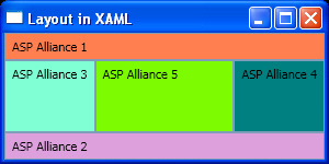
Listing 5 and Figure 5 represent five TextBoxes that are declared in a DockPanel.  We will call these TextBoxes by their background color names.

·         Coral TextBox, as the first declared element, docks to the top then gets the default height, but wraps horizontally by extending its width to fill all horizontal available space.

·         Plum, as the second element, docks to the bottom and fills all available horizontal space just the same as Coral TextBox.

·         Aquamarine docks to the left and wants to extend its height to fill all vertical space, but Coral and Plum TextBoxes have filled some space so it tries to fill any remaining space.

·         Teal docks to the right similar to Aquamarine.

·         Finally, LawnGreen does not have a DockPanel.Dock attribute so it fills all available space in DockPanel.

Listing 5

<Window x:Class="LayoutinXAML.Window1"
    xmlns="http://schemas.microsoft.com/winfx/2006/xaml/presentation"
    xmlns:x="http://schemas.microsoft.com/winfx/2006/xaml"
    Title="Layout in XAML" Height="150" Width="300"
    >
  <DockPanel>
    <TextBox Background="Coral" DockPanel.Dock="Top">
      ASP Alliance 1
    </TextBox>
    <TextBox Background="Plum" DockPanel.Dock="Bottom">
      ASP Alliance 2
    </TextBox>
    <TextBox Background="Aquamarine" DockPanel.Dock="Left">
      ASP Alliance 3
    </TextBox>
    <TextBox Background="Teal" DockPanel.Dock="Right">
      ASP Alliance 4
    </TextBox>
    <TextBox Background="LawnGreen">
      ASP Alliance 5
    </TextBox>
  </DockPanel>
</Window>

Figure 5

Now let us remove the last TextBox, LawnGreen, to see what will happen for Listing 6 in Figure 6.  Everything is the same as the previous output except that Teal wraps to fill all available space and does not get the default width.

Listing 6

<Window x:Class="LayoutinXAML.Window1"
    xmlns="http://schemas.microsoft.com/winfx/2006/xaml/presentation"
    xmlns:x="http://schemas.microsoft.com/winfx/2006/xaml"
    Title="Layout in XAML" Height="150" Width="300"
    >
  <DockPanel>
    <TextBox Background="Coral" DockPanel.Dock="Top">
      ASP Alliance 1
    </TextBox>
    <TextBox Background="Plum" DockPanel.Dock="Bottom">
      ASP Alliance 2
    </TextBox>
    <TextBox Background="Aquamarine" DockPanel.Dock="Left">
      ASP Alliance 3
    </TextBox>
    <TextBox Background="Teal" DockPanel.Dock="Right">
      ASP Alliance 4
    </TextBox>
  </DockPanel>
</Window>

Figure 6

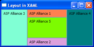
In Listing 7 I reorder elements in Listing 5 and put the Aquamarine and Teal TextBoxes before Coral and Plum.  The output is shown in Figure 7.  As Aquamarine is declared first, docks to left then wraps vertically; Teal does the same on the right.  Coral and Plum are declared after these two so you do not have the same space as before to wrap horizontally.

Listing 7

<Window x:Class="LayoutinXAML.Window1"
    xmlns="http://schemas.microsoft.com/winfx/2006/xaml/presentation"
    xmlns:x="http://schemas.microsoft.com/winfx/2006/xaml"
    Title="Layout in XAML" Height="150" Width="300"
    >
  <DockPanel>
    <TextBox Background="Aquamarine" DockPanel.Dock="Left">
      ASP Alliance 3
    </TextBox>
    <TextBox Background="Teal" DockPanel.Dock="Right">
      ASP Alliance 4
    </TextBox>
    <TextBox Background="Coral" DockPanel.Dock="Top">
      ASP Alliance 1
    </TextBox>
    <TextBox Background="Plum" DockPanel.Dock="Bottom">
      ASP Alliance 2
    </TextBox>
    <TextBox Background="LawnGreen">
      ASP Alliance 5
    </TextBox>
  </DockPanel>
</Window>

Figure 7

Note that if you set the Width or Height of an element, it will get these values and will not wrap horizontally or vertically, but other elements cannot fill the remaining space.

Grid

Grid is my favorite Panel element and you will use it more than others.  Grid is the XAML equivalent of what you saw as Table in CSS.

Each Grid has some Rows and Columns to let you position other elements within them.  As with DockPanel, Grid has some Attached Properties.  Each child element can have a Grid.Row and Grid.Column attribute to position it in a specific cell.  Grid has its own child elements to declare the schema of it.  Grid.RowDefinitions and Grid.ColumnDefinitions are the elements that declare the schema of Grid.  Grid.RowDefinitions can have a collection of RowDefinition elements and Grid.ColumnDefinitions can have a collection of ColumnDefinition elements.

Each of these elements declares a Row or Column in Grid.  Rows can have different heights, but their width is constant; columns can have different widths, but their height is constant.  If you set the height of a row and width of a column to Auto, it will wrap to encompass the content.

Listing 8 and Figure 8 show a simple 2×2 Grid.  I set ShowGridLines attribute for Grid to True to let you see the borders between cells.  Ignore Margin attribute for each TextBox for now, I will talk about it in the next section.

Listing 8

<Window x:Class="LayoutinXAML.Window1"
    xmlns="http://schemas.microsoft.com/winfx/2006/xaml/presentation"
    xmlns:x="http://schemas.microsoft.com/winfx/2006/xaml"
    Title="Layout in XAML" Height="150" Width="300"
    >
  <Grid ShowGridLines="True">
    <Grid.RowDefinitions>
      <RowDefinition />
      <RowDefinition />
    </Grid.RowDefinitions>
    <Grid.ColumnDefinitions>
      <ColumnDefinition  />
      <ColumnDefinition />
    </Grid.ColumnDefinitions>
 
    <TextBox Background="Coral" Grid.Row="0" Grid.Column="0" 
             Margin="5">
      ASP Alliance 1
    </TextBox>
    <TextBox Background="Plum" Grid.Row="0" Grid.Column="1" 
             Margin="5">
      ASP Alliance 2
    </TextBox>
    <TextBox Background="Aquamarine" Grid.Row="1" Grid.Column="0" 
             Margin="5">
      ASP Alliance 3
    </TextBox>
    <TextBox Background="Teal" Grid.Row="1" Grid.Column="1" 
             Margin="5">
      ASP Alliance 4
    </TextBox>
  </Grid>
</Window>
  

Figure 8

You can also span your rows and columns by using Grid.RowSpan and Grid.ColumnSpan attributes.

Listing 9 and its output, Figure 9, show a 3×3 Grid with some rows and columns spanned.

Listing 9

<Window x:Class="LayoutinXAML.Window1"
    xmlns="http://schemas.microsoft.com/winfx/2006/xaml/presentation"
    xmlns:x="http://schemas.microsoft.com/winfx/2006/xaml"
    Title="Layout in XAML" Height="150" Width="300"
    >
  <Grid ShowGridLines="True">
    <Grid.RowDefinitions>
      <RowDefinition />
      <RowDefinition />
      <RowDefinition />
    </Grid.RowDefinitions>
    <Grid.ColumnDefinitions>
      <ColumnDefinition  />
      <ColumnDefinition />
      <ColumnDefinition />
    </Grid.ColumnDefinitions>
 
    <TextBox Background="Coral" Grid.Row="0" Margin="5" 
             Grid.ColumnSpan="2">
      ASP Alliance 1
    </TextBox>
    <TextBox Background="Plum" Grid.Row="0" Grid.Column="2" 
             Margin="5">
      ASP Alliance 2
    </TextBox>
    <TextBox Background="Aquamarine" Grid.Row="1" Grid.Column="0" 
             Margin="5" Grid.RowSpan="2">
      ASP Alliance 3
    </TextBox>
    <TextBox Background="Teal" Grid.Row="1" Grid.Column="1" 
             Margin="5">
      ASP Alliance 4
    </TextBox>
    <TextBox Background="LawnGreen" Grid.Row="2" Grid.Column="2" 
             Margin="5">
      ASP Alliance 5
    </TextBox>
  </Grid>
</Window>

Figure 9

Margin and Padding

Hopefully these concepts are familiar to you from CSS.  Any control has these two attributes.  Margin is the distance between a control and its children and Padding is the distance between the  outer edge of a control and its children.  Padding can be applied to three elements: Block, Border and Control since these elements have an outer edge.

As with Margin in CSS, you can have Margin values for Left, Top, Right and Bottom via abbreviated syntax with this order: Left, Top, Right and Bottom.

Listing 10 is a modified version of Listing 8 to show the concept of a Margin in action and Figure 10 shows is its output.

Listing 10

<Window x:Class="LayoutinXAML.Window1"
    xmlns="http://schemas.microsoft.com/winfx/2006/xaml/presentation"
    xmlns:x="http://schemas.microsoft.com/winfx/2006/xaml"
    Title="Layout in XAML" Height="150" Width="300"
    >
  <Grid ShowGridLines="True">
    <Grid.RowDefinitions>      
      <RowDefinition />
      <RowDefinition />
    </Grid.RowDefinitions>
    <Grid.ColumnDefinitions>
      <ColumnDefinition  />
      <ColumnDefinition />    
    </Grid.ColumnDefinitions>
 
    <TextBox Background="Coral" Grid.Row="0" Margin="10">
      ASP Alliance 1
    </TextBox>
    <TextBox Background="Plum" Grid.Row="0" Grid.Column="2" 
             Margin="0 10 0 10">
      ASP Alliance 2
    </TextBox>
    <TextBox Background="Aquamarine" Grid.Row="1" Grid.Column="0" 
             Margin="10 0 10 0">
      ASP Alliance 3
    </TextBox>
    <TextBox Background="Teal" Grid.Row="1" Grid.Column="1" 
             Margin="0, 0, 10, 10">
      ASP Alliance 4
    </TextBox> 
  </Grid>
</Window>

Figure 10

Canvas

Canvas is a solution for absolute positioning in XAML.  Canvas has four Attached Properties in its child elements: Canvas.Top, Canvas.Left, Canvas.Right and Canvas.Bottom.

These attributes specify the distance between the top left corner of an element and its parent Canvas.  Obviously, by setting one of Canvas.Top and Canvas.Bottom and one of Canvas.Left and Canvas.Right, you will get the result and do not need to set others.  However, if you set both attributes, Canvas.Top and Canvas.Left are preferred.  Also, you can set only one of these attributes for an element.

Listing 11 and Figure 11 help you to see the concept of Canvas in a simple example.

Listing 11

<Window x:Class="LayoutinXAML.Window1"
    xmlns="http://schemas.microsoft.com/winfx/2006/xaml/presentation"
    xmlns:x="http://schemas.microsoft.com/winfx/2006/xaml"
    Title="Layout in XAML" Height="300" Width="300"
    >
  <Canvas>
    <TextBox Background="Coral" Grid.Row="0" Grid.Column="0" 
             Canvas.Top="10" Canvas.Left="20">
      ASP Alliance 1
    </TextBox>
    <TextBox Background="Plum" Grid.Row="0" Grid.Column="1" 
             Canvas.Bottom="60" Canvas.Left="40">
      ASP Alliance 2
    </TextBox>
    <TextBox Background="Aquamarine" Grid.Row="1" Grid.Column="0"
             Canvas.Top="80" Canvas.Right="110">
      ASP Alliance 3
    </TextBox>
    <TextBox Background="Teal" Grid.Row="1" Grid.Column="1"
              Canvas.Bottom="95" Canvas.Right="30">
      ASP Alliance 4
    </TextBox>
  </Canvas>
</Window>

Figure 11

I said Canvas Attached Properties have relative values to their parent Canvas elements.  So if you nest a Canvas element within another and declare some elements in second Canvas, those elements will get their position from their direct parent Canvas.  Listing 12 and Figure 12 show this concept.

Listing 12

<Window x:Class="LayoutinXAML.Window1"
    xmlns="http://schemas.microsoft.com/winfx/2006/xaml/presentation"
    xmlns:x="http://schemas.microsoft.com/winfx/2006/xaml"
    Title="Layout in XAML" Height="300" Width="300"
    >
  <Canvas>
    <TextBox Background="Coral" Grid.Row="0" Grid.Column="0" 
             Canvas.Top="10" Canvas.Left="20">
      ASP Alliance 1
    </TextBox>
    <TextBox Background="Plum" Grid.Row="0" Grid.Column="1" 
             Canvas.Top="60" Canvas.Left="40">
      ASP Alliance 2
    </TextBox>
    <Canvas Canvas.Top="120" Canvas.Left="140">
      <TextBox Background="Aquamarine" Grid.Row="1" Grid.Column="0"
         Canvas.Top="5" Canvas.Left="10">
        ASP Alliance 3
      </TextBox>
      <TextBox Background="Teal" Grid.Row="1" Grid.Column="1"
                Canvas.Top="60" Canvas.Left="50">
        ASP Alliance 4
      </TextBox>
    </Canvas>
  </Canvas>
</Window>

Figure 12

Summary

In this article I discussed Panel elements in XAML and some other ways to manage the layout of your user interface.  I tried to cover all fundamentals of layout in XAML to let beginners learn them, but there are more details about these topics that require further reading and training.


Product Spotlight
Product Spotlight 

©Copyright 1998-2024 ASPAlliance.com  |  Page Processed at 2024-04-26 11:25:45 PM  AspAlliance Recent Articles RSS Feed
About ASPAlliance | Newsgroups | Advertise | Authors | Email Lists | Feedback | Link To Us | Privacy | Search