Grid is my favorite Panel element and you will use it more
than others. Grid is the XAML equivalent of what you saw as Table in CSS.
Each Grid has some Rows and Columns to let you position
other elements within them. As with DockPanel, Grid has some Attached
Properties. Each child element can have a Grid.Row and Grid.Column attribute
to position it in a specific cell. Grid has its own child elements to declare
the schema of it. Grid.RowDefinitions and Grid.ColumnDefinitions are the
elements that declare the schema of Grid. Grid.RowDefinitions can have a
collection of RowDefinition elements and Grid.ColumnDefinitions can have a
collection of ColumnDefinition elements.
Each of these elements declares a Row or Column in Grid. Rows
can have different heights, but their width is constant; columns can have
different widths, but their height is constant. If you set the height of a row
and width of a column to Auto, it will wrap to encompass the content.
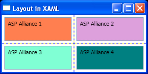
Listing 8 and Figure 8 show a simple 2×2 Grid. I set
ShowGridLines attribute for Grid to True to let you see the borders between
cells. Ignore Margin attribute for each TextBox for now, I will talk about it
in the next section.
Listing 8
<Window x:Class="LayoutinXAML.Window1"
    xmlns="http://schemas.microsoft.com/winfx/2006/xaml/presentation"
    xmlns:x="http://schemas.microsoft.com/winfx/2006/xaml"
    Title="Layout in XAML" Height="150" Width="300"
    >
  <Grid ShowGridLines="True">
    <Grid.RowDefinitions>
      <RowDefinition />
      <RowDefinition />
    </Grid.RowDefinitions>
    <Grid.ColumnDefinitions>
      <ColumnDefinition  />
      <ColumnDefinition />
    </Grid.ColumnDefinitions>

    <TextBox Background="Coral" Grid.Row="0" Grid.Column="0"
             Margin="5">
      ASP Alliance 1
    </TextBox>
    <TextBox Background="Plum" Grid.Row="0" Grid.Column="1"
             Margin="5">
      ASP Alliance 2
    </TextBox>
    <TextBox Background="Aquamarine" Grid.Row="1" Grid.Column="0"
             Margin="5">
      ASP Alliance 3
    </TextBox>
    <TextBox Background="Teal" Grid.Row="1" Grid.Column="1"
             Margin="5">
      ASP Alliance 4
    </TextBox>
  </Grid>
</Window>
Figure 8

You can also span your rows and columns by using
Grid.RowSpan and Grid.ColumnSpan attributes.
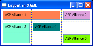
Listing 9 and its output, Figure 9, show a 3×3 Grid with
some rows and columns spanned.
Listing 9
<Window x:Class="LayoutinXAML.Window1"
    xmlns="http://schemas.microsoft.com/winfx/2006/xaml/presentation"
    xmlns:x="http://schemas.microsoft.com/winfx/2006/xaml"
    Title="Layout in XAML" Height="150" Width="300"
    >
  <Grid ShowGridLines="True">
    <Grid.RowDefinitions>
      <RowDefinition />
      <RowDefinition />
      <RowDefinition />
    </Grid.RowDefinitions>
    <Grid.ColumnDefinitions>
      <ColumnDefinition  />
      <ColumnDefinition />
      <ColumnDefinition />
    </Grid.ColumnDefinitions>

    <TextBox Background="Coral" Grid.Row="0" Margin="5"
             Grid.ColumnSpan="2">
      ASP Alliance 1
    </TextBox>
    <TextBox Background="Plum" Grid.Row="0" Grid.Column="2"
             Margin="5">
      ASP Alliance 2
    </TextBox>
    <TextBox Background="Aquamarine" Grid.Row="1" Grid.Column="0"
             Margin="5" Grid.RowSpan="2">
      ASP Alliance 3
    </TextBox>
    <TextBox Background="Teal" Grid.Row="1" Grid.Column="1"
             Margin="5">
      ASP Alliance 4
    </TextBox>
    <TextBox Background="LawnGreen" Grid.Row="2" Grid.Column="2"
             Margin="5">
      ASP Alliance 5
    </TextBox>
  </Grid>
</Window>
Figure 9
