Storyboard elements can be declared to contain animations. Storyboard
elements should be nested in the BeginStoryboard parent element. You can
declare several Storyboard elements for different animations within a
BeginStoryboard element.
As I stated in previous section, each Storyboard consists of
a collection of animation type elements that specify the type and behavior of
that animation. A storyboard element has two important attributes:
·
Storyboard.Targetname: This is the target element name.
·
Storyboard.TargetProperty: The attribute that should be affected
for the element that is specified in Storyboard.Targetname attribute.
On the basis of the attribute type you are going to animate,
you need to choose one of the animation types. For example, if you want to
animate the width of an element, you should use DoubleAnimation. If you want
to animate the color of an attribute, you should use ColorAnimation.
There are two common types of animations: ColorAnimation and
DoubleAnimation (there are other types which are similar to implement, so I
will just give my examples with these two types). You should choose one of the
types based on your needs.
Regardless of the type of animation you are declaring, animations
have five common attributes to set.
·
From: The value of the attribute at the start of animation.
·
To: The value of the attribute when animation ends.
·
By: The intermediate value of the attribute between the first and
last values.
·
Duration: The duration of the animation.
·
RepeatBehavior: Specifies the behavior of animation. It will be
discussed in more detail later.
Let us see some examples.
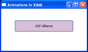
Listing 1 is an animation that changes the width of a Button
from 100 to 200 when the mouse enters the Button area. It takes five seconds
then ends. It is very simple and does not need any comment.
Listing 1
<Window x:Class="AnimationsInXAML.Window1"
    xmlns="http://schemas.microsoft.com/winfx/2006/xaml/presentation"
    xmlns:x="http://schemas.microsoft.com/winfx/2006/xaml"
    Title="Animations In XAML" Height="180" Width="300"
    >
  <StackPanel>
    <StackPanel.Triggers>
      <EventTrigger RoutedEvent="Rectangle.MouseEnter">
        <EventTrigger.Actions>
          <BeginStoryboard>
            <Storyboard Storyboard.TargetName="btnSend"
                        Storyboard.TargetProperty="Width">
              <DoubleAnimation From="100"
                               To="200"
                               Duration="0:0:5"/>
            </Storyboard>
          </BeginStoryboard>
        </EventTrigger.Actions>
      </EventTrigger>
    </StackPanel.Triggers>
    <Button Name="btnSend"
            Width="100"
            Height="40"
            Margin="40"
            Background="Thistle">
      ASP Alliance
    </Button>
  </StackPanel>
</Window>
Some steps of the result are shown in Figure 1, Figure 2 and
Figure 3.
Figure 1

Figure 2

Figure 3
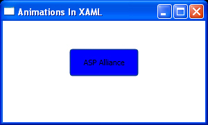
Listing 2 is another example with better details. It
changes the background color of a Button from red to blue in five seconds, but
uses "By attribute" to do this so it animates from red to beige then
to blue smoothly. Notice the usage of the new hierarchy address for
Storyboard.TargetProperty value.
Listing 2
<Window x:Class="AnimationsInXAML.Window1"
    xmlns="http://schemas.microsoft.com/winfx/2006/xaml/presentation"
    xmlns:x="http://schemas.microsoft.com/winfx/2006/xaml"
    Title="Animations In XAML" Height="180" Width="300"
    >
  <StackPanel>
    <StackPanel.Triggers>
      <EventTrigger RoutedEvent="Rectangle.MouseEnter">
        <EventTrigger.Actions>
          <BeginStoryboard>
            <Storyboard Storyboard.TargetName="btnSend"
                        Storyboard.TargetProperty="(Background).(SolidColorBrush.Color)">
              <ColorAnimation From="Red"
                              To="Blue"
                              By="Beige"
                              Duration="0:0:5" />
            </Storyboard>
          </BeginStoryboard>
        </EventTrigger.Actions>
      </EventTrigger>
    </StackPanel.Triggers>
    <Button Name="btnSend"
            Width="100"
            Height="40"
            Margin="40"
            Background="Red">
      ASP Alliance
    </Button>
  </StackPanel>
</Window>
Some steps of the result are shown in Figure 3, Figure 4 and
Figure 5.
Figure 3
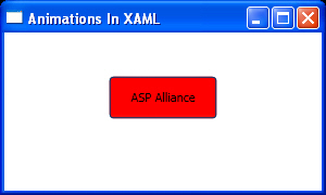
Figure 4
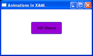
Figure 5
Listing 3 is a better example because it animates the width
of a Button from 100 to 200, but this time with Forever as the RepeatBehavior.
This causes the animation to follow until the application stops.
Listing 3:
<Window x:Class="AnimationsInXAML.Window1"
    xmlns="http://schemas.microsoft.com/winfx/2006/xaml/presentation"
    xmlns:x="http://schemas.microsoft.com/winfx/2006/xaml"
    Title="Animations In XAML" Height="180" Width="300"
    >
  <StackPanel>
    <StackPanel.Triggers>
      <EventTrigger RoutedEvent="Rectangle.MouseEnter">
        <EventTrigger.Actions>
          <BeginStoryboard>
            <Storyboard Storyboard.TargetName="btnSend"
                        Storyboard.TargetProperty="Width">
              <DoubleAnimation From="100"
                               To="200"
                               Duration="0:0:5"
                               RepeatBehavior="Forever"/>
            </Storyboard>
          </BeginStoryboard>
        </EventTrigger.Actions>
      </EventTrigger>
    </StackPanel.Triggers>
    <Button Name="btnSend"
            Width="100"
            Height="40"
            Margin="40"
            Background="Plum">
      ASP Alliance
    </Button>
  </StackPanel>
</Window>
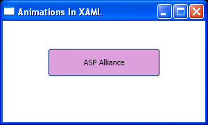
Results are shown in Figure 7, Figure 8 and Figure 9. Note
that this animation follows until you close the Window.
Figure 7
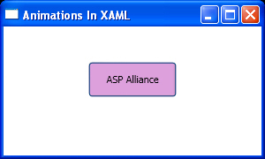
Figure 8
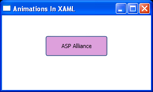
Figure 9